Last week, Esri offered a free online Live Training Seminar, Streamline GIS Workflows with ArcGIS Pro. Several interesting questions were posted on the chat line regarding geoprocessing and spatial analysis in ArcGIS Pro, so I wanted to take a few minutes to answer some of the frequently asked questions.
….Just two help links before I start…
Learn about geoprocessing in ArcGIS Pro here.
Get help for any geoprocessing tool here.
OK, the questions.
Are all the geoprocessing tools from ArcMap in ArcGIS Pro?
The majority of geoprocessing tools that are available in ArcMap are also available and working in ArcGIS Pro. Some tools have not yet been updated to work in ArcGIS Pro, but they will be available in a future release. Other tools process a dataset that is not supported in ArcGIS Pro, so they have been permanently removed. You can get more details here.
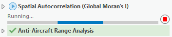
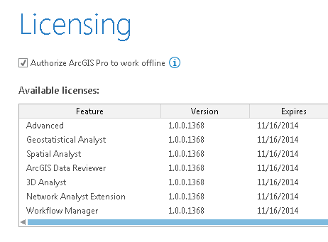
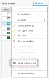
![Toolboxes in the Geoprocessing pane]()
Explore the list of all geoprocessing tools in the Geoprocessing pane
Are there new tools in ArcGIS Pro?
Yeah! There are some great new tools in Pro, including:
Most of these new tools are also available in ArcMap 10.3, or will be added in a future release of ArcMap.
ArcGIS Pro is a 64-bit, multithreaded application. Does ArcMap 10.3 now also support 64-bit, multithreaded geoprocessing?
ArcMap and ArcGIS Pro are built on different technologies. Off the shelf (my.esri.com is a shelf, right?), geoprocessing in ArcGIS Pro is 64-bit and does not block the application while a tool is running — this is what it means to be multithreaded. ArcMap has a different technology to accomplish the same goal, called background geoprocessing, which was introduced in ArcGIS Desktop 10.0. You can download and install a 64-bit version of this technology, separate from the main installation of ArcMap. Learn more about that here.
Are geoprocessing tools faster in ArcGIS Pro?
Geoprocessing performance is roughly equivalent between ArcGIS Pro and ArcMap. 64-bit geoprocessing does not make tools faster only able to load more data into memory. 64-bit geoprocessing is more robust, results will be more accurate, and processes that used to hang or run out of memory may be able to complete successfully. Likewise, a multithreaded app does not make geoprocessing faster. More details on that below.
Tell me more about geoprocessing and multithreading
When you run a geoprocessing tool in ArcGIS Pro, it runs on a thread dedicated to geoprocessing. This means that when a tool is running you can do other things in the app, such as add new data to a map, navigate and make selections in the map, change a layer’s symbology or labels, create and modify a layout, and even find and fill in another geoprocessing tool. If you run a geoprocessing tool while another tool is running, it gets added to a queue and will start running after the first one finishes.
![]()
Two tools in the queue, one finishes so the next one starts
This behavior is the same for all geoprocessing tools run inside Pro: the tools that are included in ArcGIS, and the custom tools you build in Python and ModelBuilder.
One additional note: multithreaded is not the same thing as parallel processing! Parallel processing is a technique which splits up a big job into many smaller jobs and allows multiple CPUs or processes to work on the big job at the same time, often resulting in faster processing time. A growing number of geoprocessing tools leverage parallel processing to improve performance. In the first release of Pro, there are 25 tools that support parallel processing, including a number of geostatistics tools and Spatial Analyst tools.
Are there license level or extension changes for geoprocessing tools in Pro?
No. ArcGIS Pro has the same licensing levels as other ArcGIS Desktop applications – Basic, Standard, and Advanced. The license level and extension requirements for any geoprocessing tool is the same in ArcMap and ArcGIS Pro. Refer to the tool help page to learn what license and extension is required.
Does ArcGIS Pro have ModelBuilder?
Yes, you can build geoprocessing models in a ModelBuilder view, and run those models in the same ways you do in ArcMap. You can learn about ModelBuilder in ArcGIS Pro here and get migration tips here.
![]()
ModelBuilder in ArcGIS Pro
Will models built in previous versions of ArcMap work in ArcGIS Pro?
Yes, most of the time. There are a few exceptions:
- If a tool in the model is not yet available in Pro, then the model will not work. You may need to wait until that tool is available in a future release of Pro, or you can remove the tool and try to find a workaround.
- If a tool in the model has changed in Pro, then the model will not work until you update the model (simply open the model in Pro, validate, and save). Refer to a tool’s help page to determine what needs to be changed for the tool to work in Pro. One common issue is the Calculate Field tool has changed to support only Python expressions. Learn more about that specific change here.
Caution! Models that are built new, or opened and saved in ArcGIS Pro, cannot be directly used in ArcMap. But you can always save the containing toolbox as a previous version (10.3, 10.2, etc.) and then use that toolbox back in ArcMap. It’s safest to make a copy of the original toolbox before modifying any models in Pro.
What is the difference between Tasks and ModelBuilder?
Tasks and ModelBuilder are conceptually similar, but have different goals and capabilities.
Tasks are a set of preconfigured steps through a process or workflow in ArcGIS Pro. Task steps can include any GIS tasks, such as zooming to a specific feature, editing a layer, running geoprocessing tools, authoring a map, and sharing it online.
ModelBuilder on the other hand is specifically designed to author and automate geoprocessing workflows. It includes features to support powerful operations like batch processing and simulation, and can be used to create a custom geoprocessing tool that can be used by others with different data.
![]()
Model that re-projects and adds a new attribute field to every feature class in a geodatabase
Tasks are not a replacement for ModelBuilder, and ModelBuilder tools can even be included as one step in a Task.
Will Python scripts and toolboxes written for ArcGIS 10.x (using Python 2.x) work in ArcGIS Pro?
Usually, yes. ArcGIS Pro uses Python 3.4, while the other apps in ArcGIS Desktop & Server 10.3 use Python 2.x. Despite some significant differences between these versions of Python, many geoprocessing scripts can be used as-is in both ArcMap and ArcGIS Pro. In my experience there are a few common issues that will require you to update your scripts:
- Some geoprocessing tools have been removed from ArcGIS Pro. If your script includes one of these tools you will either need to find a workaround or simply wait until the tool or a replacement has been added to Pro.
- The arcpy.mapping module has been removed in Pro, and replaced with the new arcpy.mp module for working with maps in Pro’s new project-based design.
- Print statements will need to be changed to use the new print function.
- Working with Python dictionary items is a little different
- Use of urllib2 in Python 2 will need to be changed to use the new urllib library in Python 3.
![]()
Toolbox with many Python script tools, all of which were written in ArcMap 10.1 and work without any modification in Pro.
There are other things you will need to update, these are just some common things I have run into. Read this help topic for more details.
To help you on the way of migrating Python scripts from 2 to 3, ArcGIS Pro and ArcMap 10.3 both have a new geoprocessing tool for analyzing a Python script file or toolbox and giving line-by-line instructions on required changes.
Are both personal and file geodatabases available as data sources for ArcGIS Pro?
Personal geodatabases are not supported in ArcGIS Pro, so you cannot use personal geodatabase datasets as inputs to geoprocessing tools or create those datasets as outputs.
File geodatabases are fully supported and are the default workspaces for ArcGIS Pro projects.
Do analysis services and new tools like Enrich Layer use ArcGIS Online service credits?
Yes. In ArcGIS Pro you can connect to and use several ready-to-use analysis services, including:
- http://hydro.arcgis.com/arcgis/services
- http://elevation.arcgis.com/arcgis/services
- http://logistics.arcgis.com/arcgis/services
These services make it incredibly easy to perform analysis without needing to hunt for or prepare data, read documentation, or follow best-practices. For example, you can get street network routing without needing your own Network Analyst dataset, or perform a Viewshed analysis without needing to download and prepare a DEM for your study area. These services consume credits.
![]()
ArcGIS Pro also includes a new geoprocessing tool, Enrich Layer, which enables you to add demographic, landscape, and community tapestry information to your GIS data. For example, you can add a population field to a school district layer, and the population will be correctly apportioned from overlapping census data to calculate a sum. This tool consumes credits.
Can I publish a geoprocessing service?
The first release of ArcGIS Pro does not allow you to publish geoprocessing services. In fact, you cannot publish any services to an ArcGIS server, as you can only make user connections to these servers. Publishing functionality will be added at a later release.
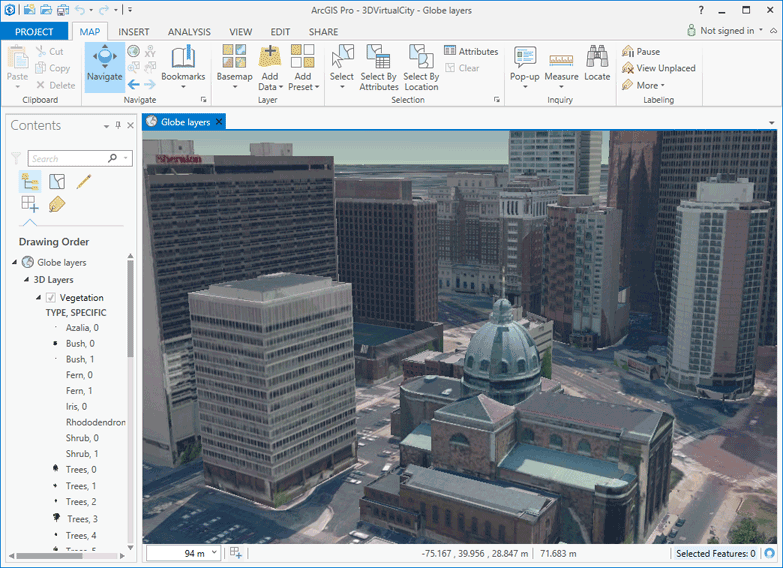
Is the 3D Analyst extension required for ArcGIS Pro to work with 3D maps and layouts?
The 3D Analyst extension is only required for performing 3D analysis; if you want to run geoprocessing tools in the 3D Analyst toolbox, you need the 3D Analyst extension. Even if you don’t have this extension you can still navigate, author, edit, and share 3D maps.
Thanks for reading! I’ll be happy to answer more questions in the comments.


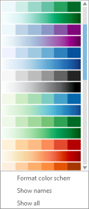
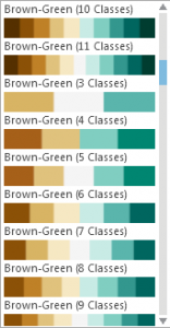
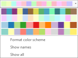
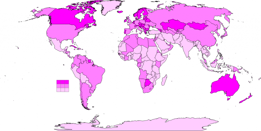
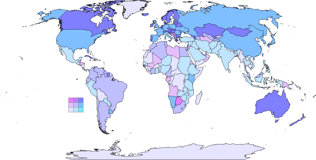
 ArcGIS Pro offers a rich new experience for making maps. Over the next few weeks we’ll be sharing many of the new and exciting features that will help you better design and share beautiful maps. Today we’ll look at how we’ve rebuilt the color palettes to provide better default options and an improved selection of color choices.
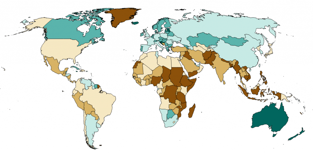
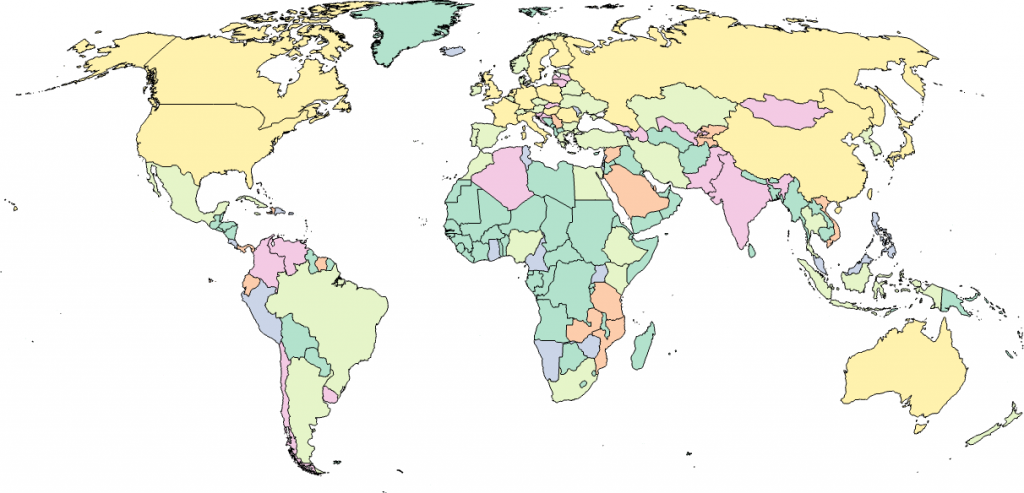
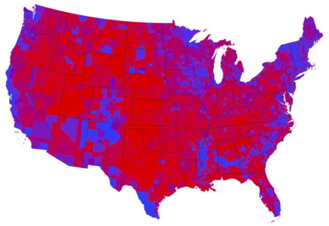
 One of the main benefits of redesigning a software package from the ground up is you can reflect on some of the limitations of what went before and deal with them head on. Most people who have a long history with ArcMap have at one time or another wanted to apply a little transparency to their symbols and have been frustrated to find the options limited (I’m one of these people!). This is something of which we’ve been acutely aware as we began the process of designing and building ArcGIS Pro. The completely redesigned graphics engine in ArcGIS Pro supports a rich array of possibilities for improved control over your graphics which has major benefits for your mapping. Let’s take a quick look at how modifying transparency for your map layers and symbols can begin to extend your cartographic possibilities.
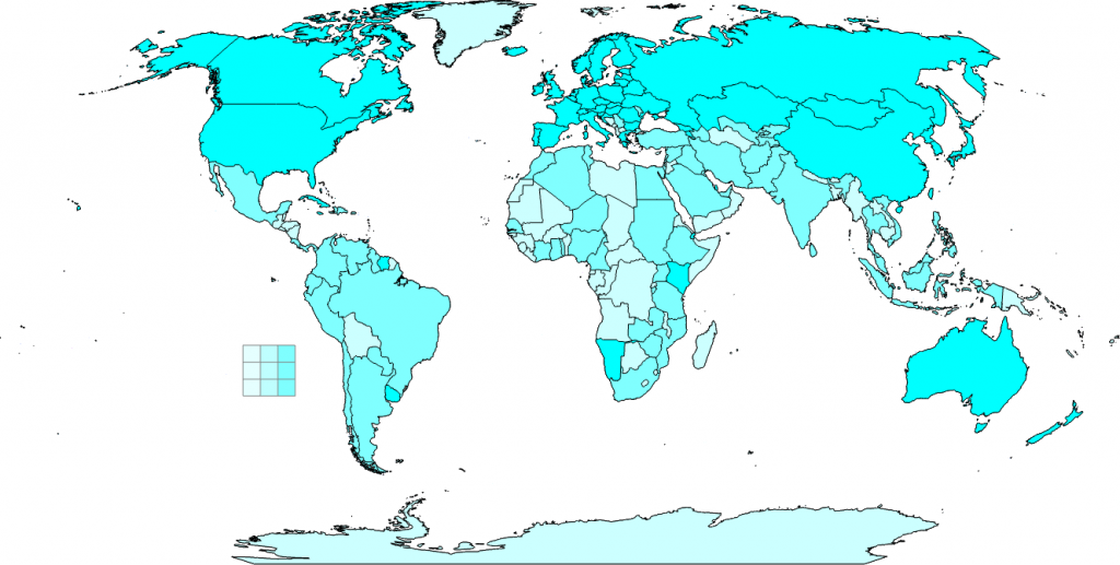
 The latest